
Showcase
Thirteen things it does, shown once each.
In the order you meet them: the file lands, the schedule gets graded, the logic gets traced, the crews get levelled, the money gets attached, and something printable comes out at the end. Screenshots are from the sample project that ships with LumaPlan.
01 Interchange
Open the file you were sent.
A .mpp from the client's planner and a .xer
from the steel subcontractor open directly — along with
.mspdi/.xml, .pmxml and
.mpx. Activities, logic, calendars, constraints, resources
and codes come across, and the same formats go back out, so the file you
return is one they can open. A task list in .xlsx or
.csv comes in separately, through its own column mapper.
Date arithmetic follows MS Project or P6 conventions, set per project — the two disagree, and your dates should match whoever you report to.
.mpp: MS Project work goes out as .mspdi, which MS Project opens natively.02 Schedule quality
Grade it before you trust it.
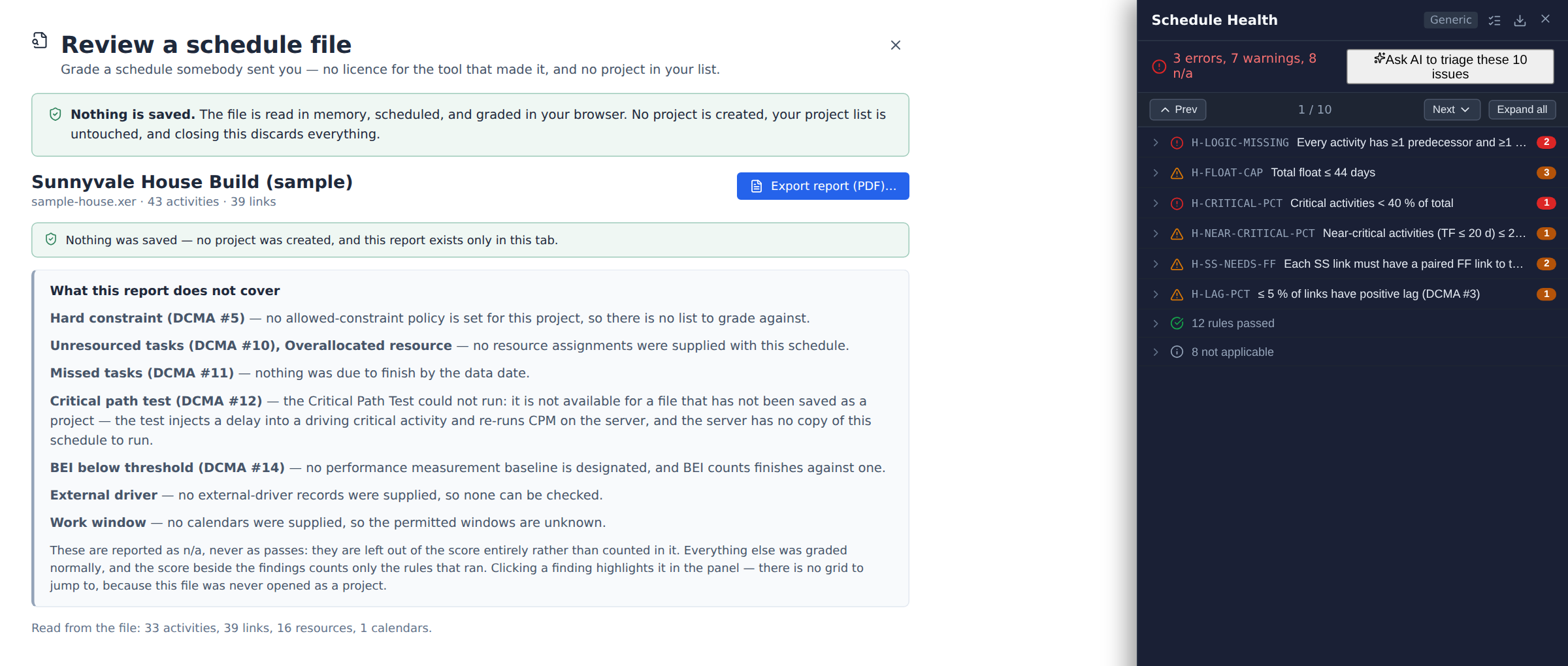
Drop a schedule file in and it is parsed, scheduled in memory and graded against 26 checks covering all fourteen DCMA points — open ends, hard constraints, negative float, lag discipline, float outliers, over-allocated crews. Nothing is saved: no project is created and your project list is untouched.
A check that has no data to work with reports not applicable and is left out of the score, rather than passing quietly. The report exports as a PDF you can attach to a review.
03 The schedule
Grid on the left, time on the right.
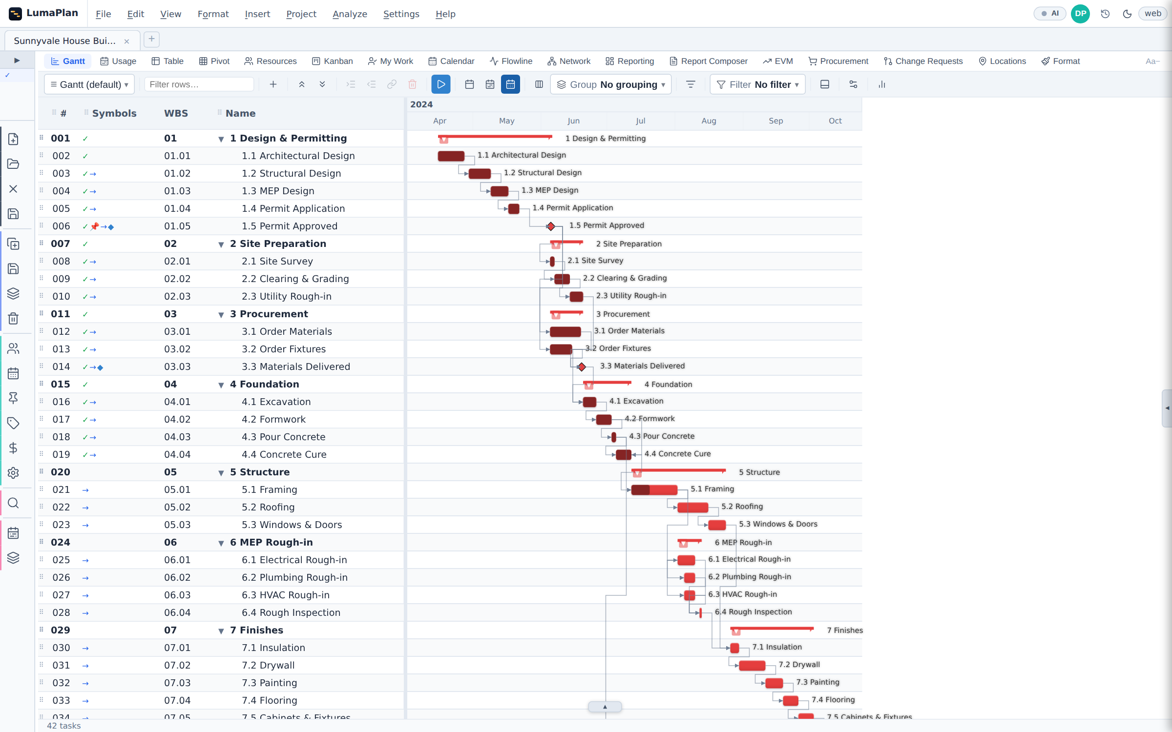
A work breakdown structure that rolls dates, cost and progress up to its summaries; all four link types with lag; constraints, deadlines and multi-shift calendars. Driving activities are painted as the scheduler computes them, on every recalculation — not on a button you have to remember to press.
The symbols column says why each activity sits where it does: driven by logic, held by a constraint, placed by hand, started, or in conflict.
04 Progress
Status it the way the site reports it.
Set a data date and record what actually happened: actual start, actual finish, percent complete, remaining duration. Work that ran out of sequence is handled explicitly — retained logic or progress override, chosen per project, rather than silently.
For the person collecting the update there is a personal work list and a board; for the person issuing it, a lookahead window and a progress line on the bars.
05 Analysis
Not one critical path — ranked ones.
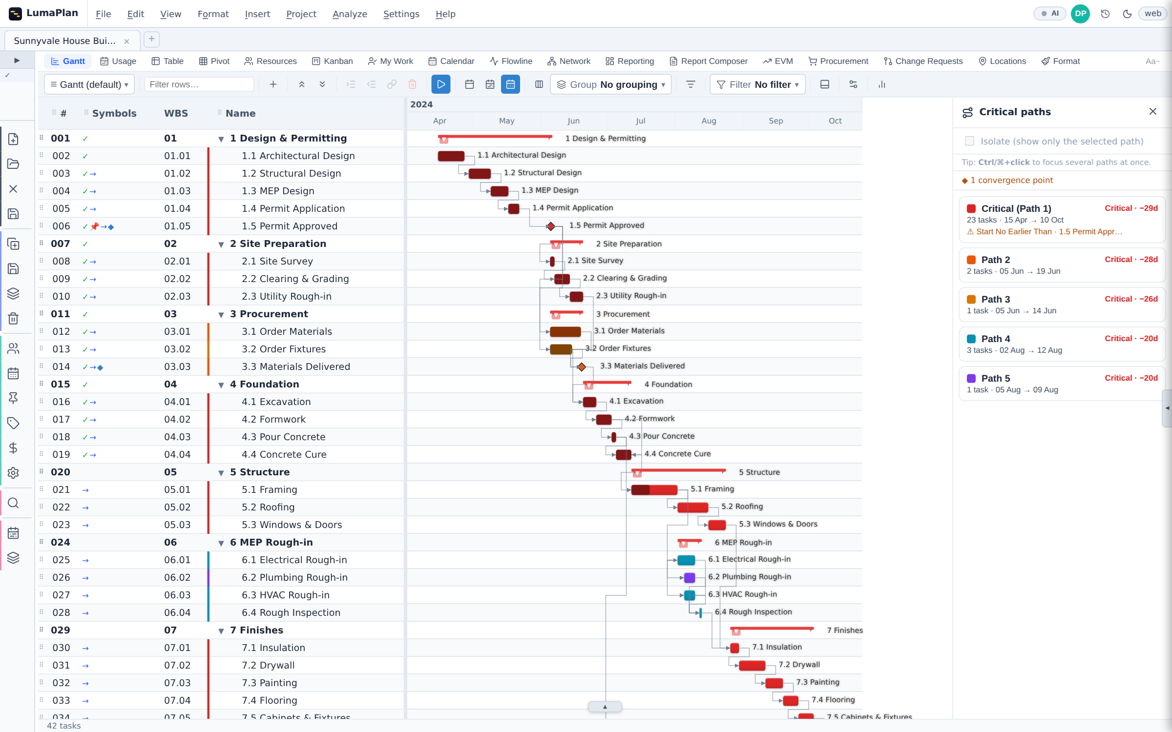
The Critical Paths Analyzer ranks every driving chain by float and colours each one on the bars, so the second and third chains are visible before one of them becomes the driver. Each path lists its activity count and its window, and names what is holding it — a constraint, a deadline or a conflict — when there is something to name.
Isolate hides everything else. Convergence points — where several chains land on one activity — are flagged: a slip there eats float on every chain running through it.
06 Portfolio
When the driver is in someone else's schedule.
Activities link across project boundaries, and the whole portfolio schedules in one pass — so a slip in the fabrication programme moves the commissioning milestone in a different file, instead of being discovered at the next coordination meeting.
Resource demand aggregates across a parent and every sub-project beneath it, and a link that writes into a project you do not own can be made to wait for that project's approval.
07 Resources
Load first. Then levelled.
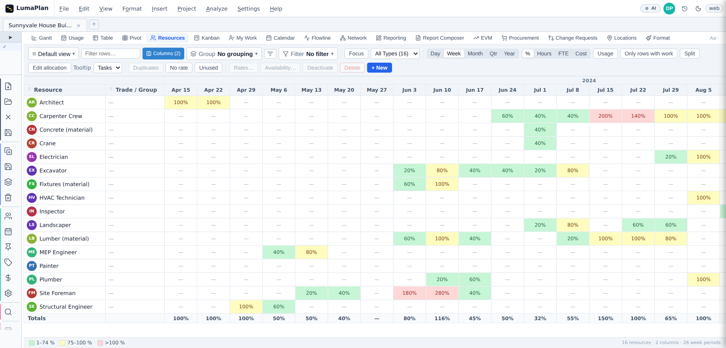
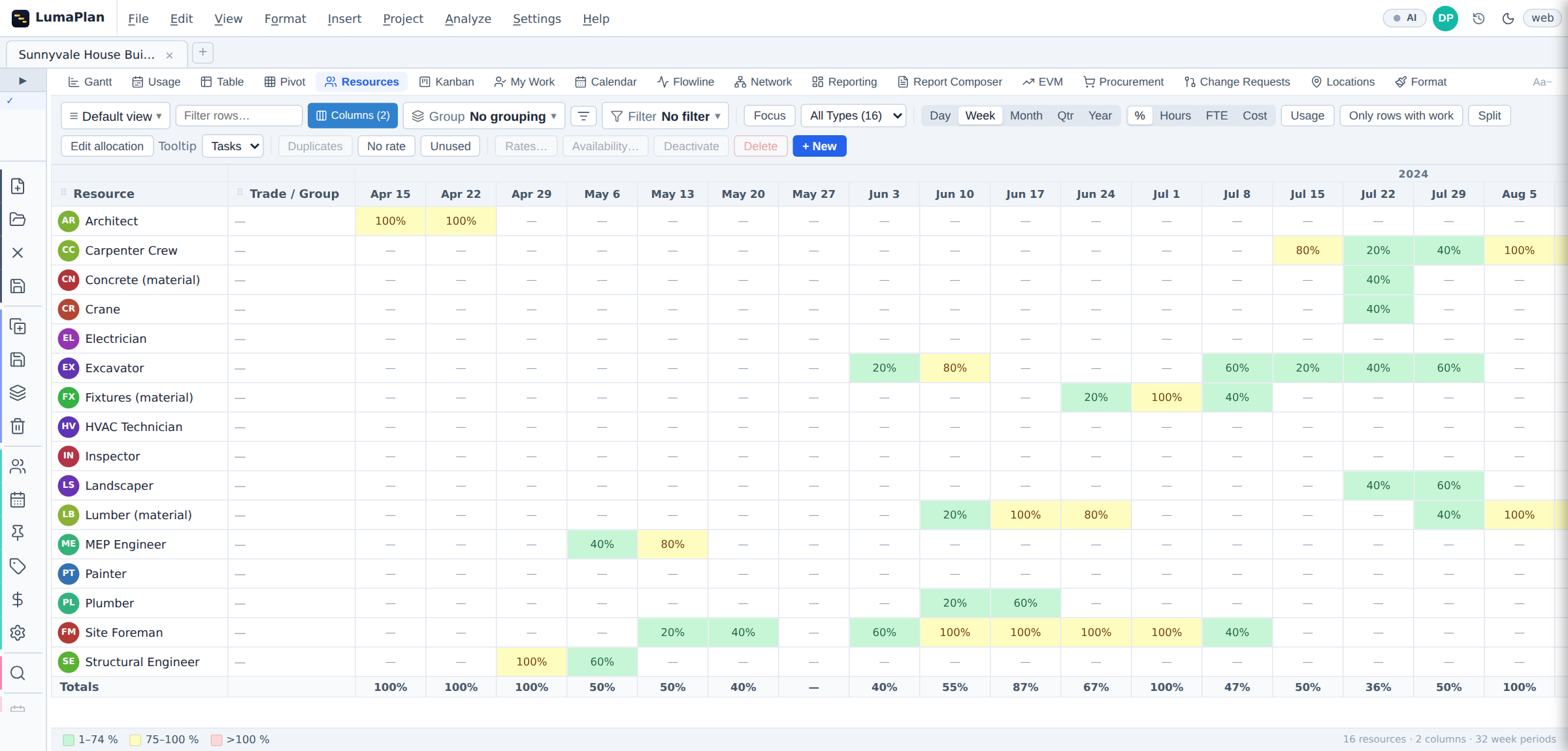
The resource grid prices demand against capacity period by period, in percent, hours, full-time equivalents or cost. Anything over capacity is red before anyone has to add it up: below, a carpenter crew booked at 200 % and a foreman at 280 %.
Levelling offers two algorithms — a serial first-fit and an iterative resource-constrained CPM — and a choice between keeping the end date (moving activities within their float only) and letting it move. Below that, the same grid after a run: no cell over capacity, and the programme six weeks longer for it.
08 Risk
A date with a probability on it.
Give activities three-point durations and run the network thousands of times. What comes back is a distribution of finish dates with P10, P50 and P80 marked, and a criticality index per activity — how often each one landed on the critical path across the runs.
That last number is the useful one for a contingency conversation: it names the activities worth protecting, rather than the ones that happen to be critical in today's single pass.
09 Earned value
Earned value, off the same schedule.
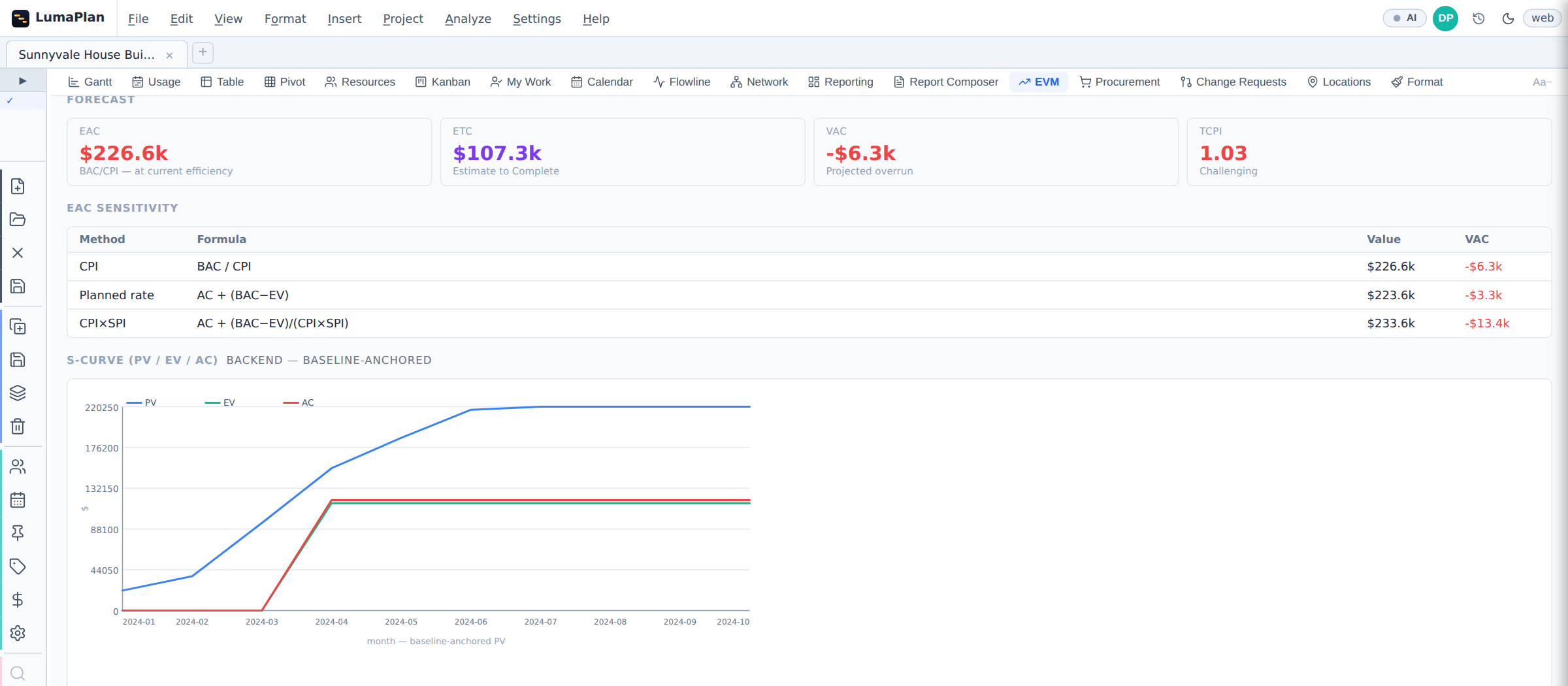
Planned value, earned value and actual cost against a designated performance measurement baseline, with the S-curve, CPI and SPI, and estimate at completion computed three ways at once — by cost efficiency, at the planned rate, and by cost and schedule efficiency together — so a forecast that only works under one assumption is obvious.
Actual cost can come from the schedule's own actuals or from an imported accounting ledger, chosen per project.
10 Accounting
The month-end file, attached to the plan.
Accounting exports, staffing rosters and coding tables come in through a six-screen importer — which sheet, what the columns mean, what the figures mean and when, where they land, a preview, and what happened. Ten reshape steps handle what real exports need, including turning twelve month columns into twelve rows.
Before you commit the import it measures how much of the file can actually land, priced in money rather than rows. Afterwards, one screen puts the schedule's budget and actuals beside the ledger's, month by month, with a list of the money that could not be placed.
11 4D
Where the work actually happens.
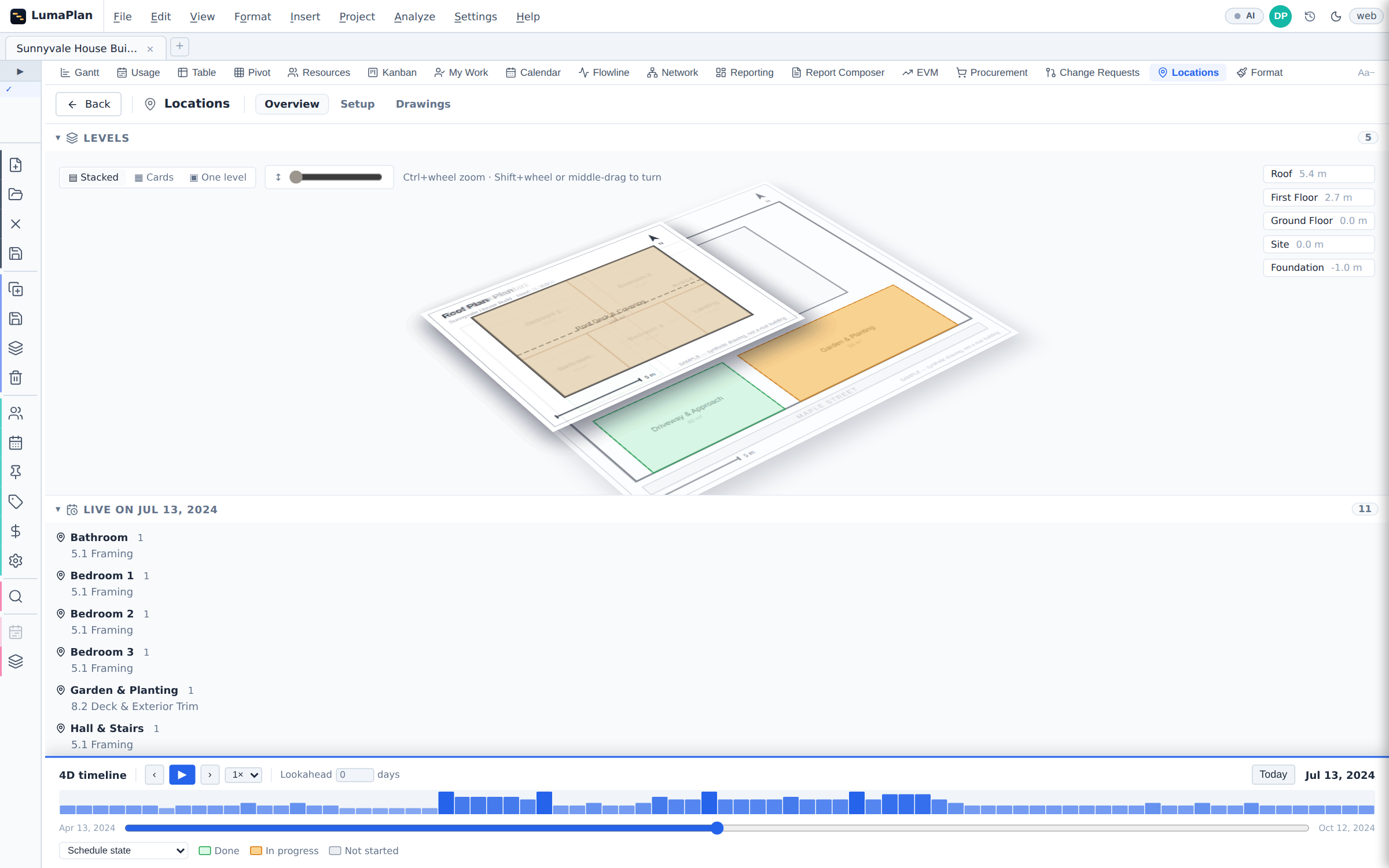
Break the job into levels and zones, put the drawing behind them, and play the schedule over the plan. Each zone colours by the state of the activities in it — not started, in progress, done — and scrubbing the timeline re-colours the whole building.
For linear and repetitive work the same location breakdown drives a flowline: one line per crew, its slope the production rate, and the gap between two lines the buffer you are relying on.
12 Output
Something you can put in front of people.
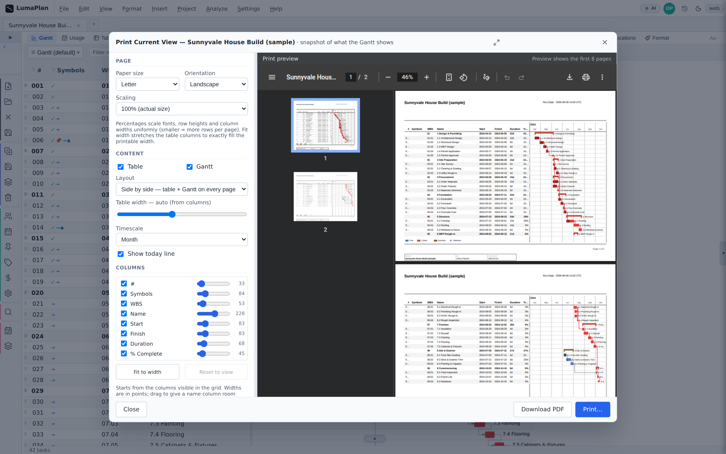
Print Current View renders what is on screen — the same columns, the same sort, the same filter — as a paginated PDF with the table and a timescaled Gantt, and previews it live while you change paper size, orientation, scaling and column widths.
Beside it: submittal PDFs from a template library, a schedule-quality report, XLSX, PowerPoint, and a 16:9 presentation view for the monthly review.
13 Views
One schedule, the lens each person needs.
The bar chart for the planner, a spreadsheet-style table for bulk edits, a board for the people doing the work, a logic diagram for the person arguing about a link, a calendar for the site, resource usage for the one buying the crews, and earned value for the one paying for them.
Same data underneath, so a change made in one is a change in all of them. It runs in the browser, installs from it to work offline, and has native macOS and Windows builds that open local files directly.
Bring a programme and try it on that.
Early access is opening to teams running live work.